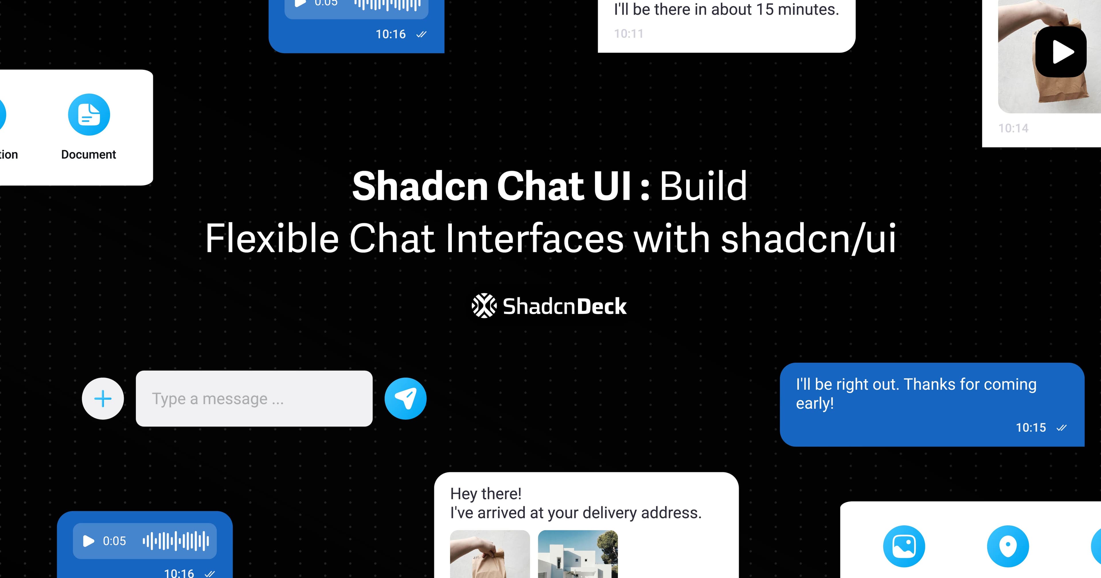
Building a chat interface from scratch means dealing with message bubbles, scroll behavior, typing indicators, file uploads, real-time updates, and a dozen other details that eat up way more time than they should.
The shadcn chat UI approach gives you composable building blocks instead of a rigid chat component. You get the primitives - Avatar, Card, ScrollArea, Input - and full control over how they work together. No wrestling with prop APIs or overriding internal styles.
Whether you're building a customer support widget, a team collaboration tool, or a messaging app, these patterns handle the common scenarios: basic conversations, group chats, typing indicators, timestamps, file attachments, and read receipts.
This guide walks through 10+ production-ready shadcn ui chat examples. Each one is copy-paste ready and built with TypeScript, Tailwind CSS, and the same shadcn/ui components you're already using.
Prerequisites
Before building chat interfaces with shadcn chat component patterns, make sure your project has these dependencies.
You need:
- React (v18 or above)
- Next.js (optional but recommended)
- Tailwind CSS configured
- shadcn/ui initialized
If you haven't set up shadcn/ui yet, initialize it:
Then add the required components:
That's all you need. These components combine to create any chat UI pattern. You control the structure, state, and styling.
Basic Chat UI Implementation
The simplest chat interface needs three parts: a header with user info, a scrollable message area, and an input field with a send button. Here's the foundation every other pattern builds on.
What you get:
- Clean message bubbles with different styles for sent vs. received
- Scrollable message area that can handle long conversations
- Avatar display for visual user identification
- Input with send button that handles Enter key
This structure is the base for every variation that follows. Group chats, typing indicators, file attachments, timestamps - they all build on these same components.
Chat UI Variations
Real chat apps need more than basic message bubbles. Users expect typing indicators, timestamps, file sharing, and status updates. Here are the patterns that handle those scenarios.
1. Chat with Typing Indicator
What it is: An animated indicator showing when someone is typing a response.
When to use: Any real-time chat where users benefit from knowing the other person is actively responding. Reduces uncertainty and keeps the conversation flowing naturally.
2. Chat with Timestamps
What it is: Messages display with time sent, helping users track conversation chronology.
When to use: Support chats, business communications, or any conversation where timing matters. Particularly useful for async messaging where responses come hours apart.
Good morning!
Good morning! How can I help?
3. Chat with Attachments
What it is: Input bar with buttons for attaching files, images, or emojis.
When to use: Support tickets, team collaboration, or anywhere users need to share files, screenshots, or documents alongside text messages.
4. Chat with Action Menu
What it is: Header with quick actions like voice call, video call, and more options.
When to use: Video conferencing apps, customer support tools, or team chat where users frequently escalate from text to voice/video.
5. Group Chat UI
What it is: Chat interface showing multiple participants with names above each message.
When to use: Team channels, project discussions, community forums, or any multi-user conversation where attribution matters.
Let's discuss the new feature!
6. Chat with Search
What it is: Search bar in the chat header for finding specific messages or keywords.
When to use: Long conversations, support tickets, or documentation where users need to quickly locate past messages without scrolling.
7. Chat Sidebar List
What it is: Sidebar showing all conversations with unread counts, timestamps, and online status.
When to use: Messaging apps, customer support dashboards, or any interface managing multiple concurrent conversations.
Messages
8. Minimal Chat UI
What it is: Stripped-down chat with just message bubbles, no headers or extra UI.
When to use: Embedded chat widgets, simple comment threads, or interfaces where screen space is limited and you want maximum focus on the conversation.
Simple message bubble
Clean and minimal
9. Chat with Read Receipts
What it is: Messages show when they've been seen, with avatars of readers.
When to use: Team communication, customer support, or anywhere message visibility tracking matters for accountability or follow-up.
Did you receive the files?
Common Implementation Patterns
Auto-scroll to Latest Message
Keep the chat scrolled to the bottom when new messages arrive:
Real-time Updates with WebSockets
Connect to a WebSocket server for live message updates:
Message Grouping by Time
Group messages by date with dividers:
Best Practices
1. Performance Optimization
For chats with hundreds of messages, use virtualization. Libraries like @tanstack/react-virtual render only visible messages, keeping scroll smooth even with massive message histories.
2. Accessibility
- Use
role="log"andaria-live="polite"on the message container for screen readers - Ensure message bubbles have sufficient color contrast
- Make the input field keyboard accessible with proper
labelandaria-label - Support keyboard navigation for action buttons
3. Mobile Responsiveness
Mobile chat needs larger tap targets and optimized layouts. Use min-h-12 for buttons, full-width inputs, and consider moving action buttons to a bottom drawer on small screens.
4. Message State Management
Track message states: sending, sent, delivered, read, failed. Show visual indicators (loading spinner, checkmark, error icon) so users always know their message status.
5. Loading States
Show skeleton loaders while fetching message history. Display the typing indicator when waiting for responses. Never leave users staring at empty screens.
Integration with Backend
Supabase Real-time Example
Firebase Real-time Example
Conclusion
Building chat UIs with shadcn chat component patterns gives you the flexibility to create exactly what your app needs without fighting a rigid component API. Every pattern here is production-ready and handles real-world scenarios.
Start with the basic implementation, then layer on features - timestamps, typing indicators, file uploads, read receipts - only when your users need them. The composable structure means you're never locked in or forced to work around limitations.
Whether you're building customer support tools, team collaboration apps, or consumer messaging products, these patterns scale from simple one-on-one chats to complex group conversations with rich media.
Related Posts
Explore more shadcn component guides:
- Shadcn Avatar Component Guide - Essential for displaying user profiles in chat interfaces
- Shadcn Accordion Component Guide - Create collapsible message threads and categories
- Shadcn Tabs Component Guide - Organize multiple chat channels or conversations
- Shadcn Select Component Guide - Add user selection and channel switching functionality