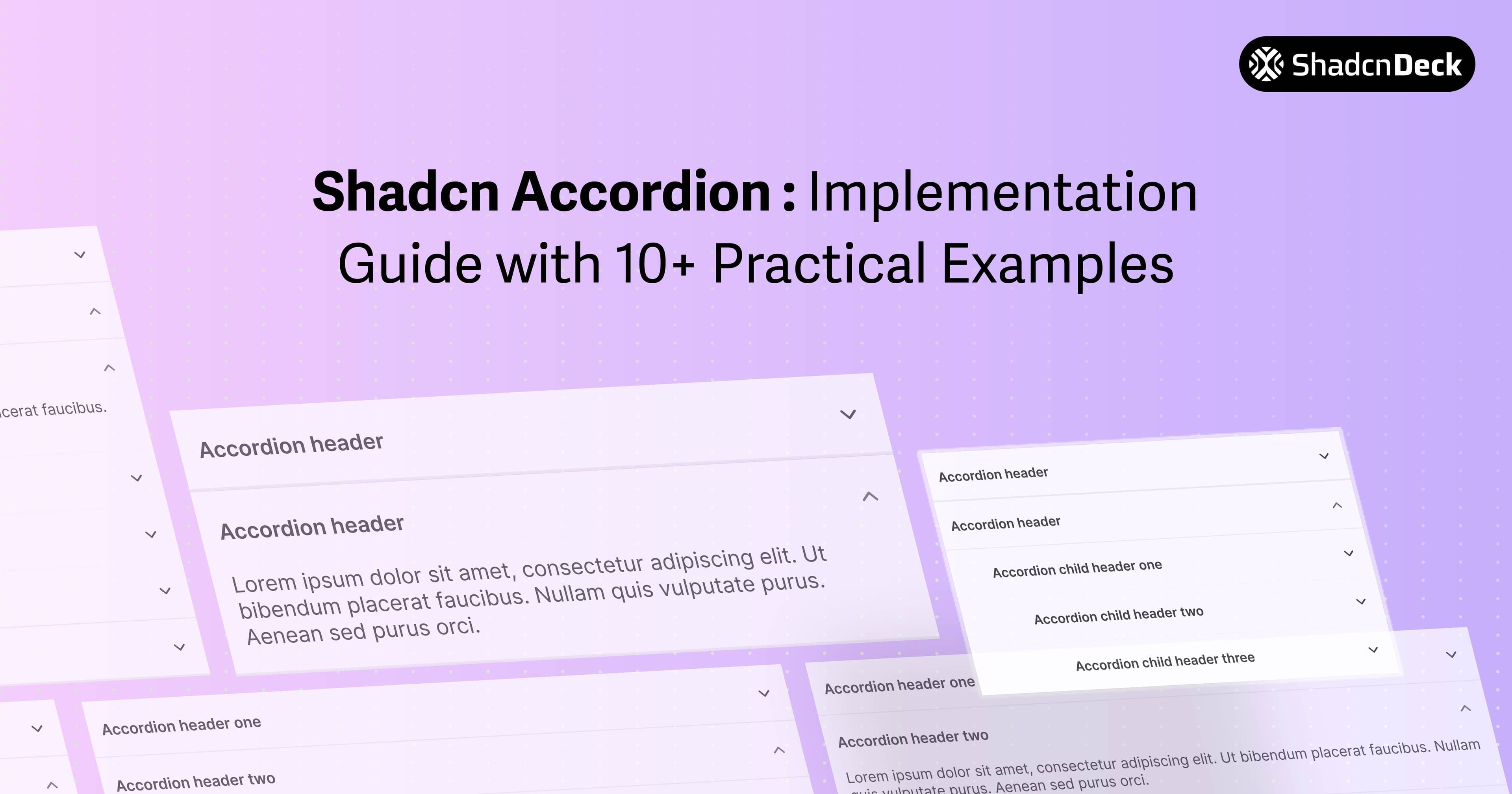
Most UI libraries give you an accordion that's either impossible to style or a nightmare for screen readers. The shadcn accordion is the exception.
Because it's essentially a wrapper around Radix UI, you get the accessibility of an enterprise-grade library with the styling freedom of Tailwind CSS. It's the go-to shadcn ui accordion for developers who need their FAQs and menus to "just work" across all devices.
We're going to break down exactly how to handle common pain points—like making the shadcn accordion open by default or tweaking those stubborn height animations—so you can ship your layout and move on to the next ticket.
Shadcn Accordion Components
Whether you are building complex dashboards or simple landing pages, the shadcn ui accordion provides the performance and accessibility primitives required for professional React applications.
Installation & Setup
To use the accordion shadcn component, you must have a project initialized with Tailwind CSS and the shadcn CLI. Run the following command to add the component to your project:
This command installs the Radix UI accordion primitive and creates an accordion.tsx file in your components directory. Ensure your tailwind.config.js includes the necessary keyframes for the default shadcn accordion slide-down and slide-up animations.
Basic Accordion Implementation
The core structure of the shadcn accordion consists of four parts: the root Accordion, the AccordionItem wrapper, the AccordionTrigger (the clickable header), and the AccordionContent (the collapsible body).
Key details:
type="single"ensures only one item can be open at a time.collapsibleallows the user to close an item even if it is the only one open.- Each
AccordionItemrequires a unique value string.
Shadcn Accordion Variations
1. Single Item Open (Default)
What it is: The standard configuration where opening one section automatically closes any other open section.
When to use: Use this for settings panels or sidebars where focus should remain on a single task or category.
Key details:
- Standard Radix UI behavior for "exclusive" expansion.
- Ideal for reducing visual clutter.
collapsibleprop is optional but recommended for UX.
2. Multiple Items Open
What it is: A configuration that allows users to expand as many sections as they want simultaneously.
When to use: Perfect for product feature lists or comparison tables where users need to see data from multiple categories at once.
Key details:
- Set
type="multiple"to enable independent toggles. - Items do not close automatically when another is clicked.
- Useful for long-form content organization.
3. Shadcn Accordion Open by Default
What it is: An accordion component with specific items expanded on initial render.
When to use: Use shadcn accordion open by default logic when you want to highlight the most important section or guide the user's eye immediately upon page load.
Key details:
- Set
defaultValue="value"to have a shadcn accordion open by default fortype="single". - For multiple items, use an array:
defaultValue={["value1", "value2"]}. - This is an uncontrolled pattern; the user retains full control after the initial render.
4. Fully Controlled Accordion
What it is: Managing the accordion's open/close state using React's useState hook.
When to use: Required for programmatic control, such as a "Close All" button or syncing state with a URL search parameter.
5. Shadcn Accordion Animation Customization
What it is: Modifying the default open and close transitions to match specific brand aesthetics.
When to use: Use shadcn accordion animation overrides when the default slide is too fast, too slow, or requires a custom easing function like "bounce."
Key details:
- Target
data-state="open"anddata-state="closed"for granular control. - Utilize Tailwind's arbitrary values (e.g.,
duration-[600ms]) for quick tweaks. - Ensure
overflow-hiddenis present on the content wrapper to prevent layout jumps.
6. Accordion with Icons
What it is: Adding custom visual indicators (like plus/minus or folder icons) to the trigger.
When to use: Enhancing visual hierarchy or providing clearer UX signals than the default chevron.
7. Styled Accordion Variants
What it is: Creating different visual "skins" like ghost, bordered, or card-style.
When to use: Matching the accordion to different sections of a website (e.g., a "Dark Mode" sidebar vs. a "Light Mode" FAQ).
8. Accordion with Rich Content
What it is: Embedding complex JSX, such as images, videos, or code snippets, inside the collapsible area.
When to use: Documentation sites or product galleries where details require more than just text.
9. Nested Accordion
What it is: Placing an accordion component inside the AccordionContent of another accordion.
When to use: Deeply hierarchical navigation or complex multi-level settings.
10. Accordion FAQ Section
What it is: A production-ready FAQ section optimized for SEO with structured data.
When to use: Help centers and landing pages.
Frequently Asked Questions
11. Accordion with Search/Filter
What it is: A dynamic accordion that filters items based on a text input.
When to use: Knowledge bases with dozens of entries.
12. Mobile-Optimized Accordion
What it is: Larger tap targets and simplified animations for touch devices.
When to use: Mobile-first web apps.
Customization & Styling
Animation Timing
You can adjust the shadcn accordion animation by targeting the CSS variables defined in your globals.css. By default, shadcn uses Tailwind's animate-accordion-down. To slow it down:
- Use
duration-500orduration-700classes on theAccordionContent. - Customize easing functions in
tailwind.config.jsusingcubic-bezierfor a more premium feel.
Theme Integration
The shadcn accordion automatically inherits colors from your CSS variables (--primary, --background, etc.). To implement a custom color scheme:
- Target
AccordionItemwithborder-primary/20. - Use
hover:bg-accenton theAccordionTriggerto highlight the interactive area.
Common Use Cases
The shadcn ui accordion is versatile enough for:
- FAQ sections: The most common use case for collapsible text.
- Navigation Menus: Specifically in mobile sidebars.
- Filter Panels: In e-commerce sites to hide/show filter categories.
- Settings Pages: Grouping related configuration toggles.
Tips & Best Practices
- Performance: For accordions with 50+ items, avoid rendering heavy components (like maps or large images) inside the content until the item is expanded.
- Accessibility: Never remove the
AccordionTriggerbutton wrapper. It provides the essential keyboard "Enter" and "Space" listeners required for WCAG compliance. - UX Design: Avoid nesting accordion shadcn components more than two levels deep, as it becomes difficult for users to track their location in the hierarchy.
- Visual Feedback: Always provide a hover state on the trigger to indicate interactivity.
Related Posts
Explore more shadcn component guides:
- Shadcn Tabs Component Guide - Build tabbed interfaces with 12+ variants and animations
- Shadcn Select Component Guide - Create custom dropdown selects with search and multi-select
- Shadcn Chat UI Guide - Build modern chat interfaces with message bubbles and typing indicators
- Shadcn Avatar Component Guide - Display user avatars with groups and status badges
