Tabs are usually the first thing you reach for when a page starts holding too much content. Settings. Account sections. Dashboard data. You want everything in one place, but not stacked on top of each other.
That's where shadcn tabs help. They're a flexible React tabs component that gives you structure without locking you into a specific design.
Since they're built on Radix UI, accessibility is already handled. Since styling runs on Tailwind, you control exactly how the tabs look - minimal, bold, vertical, icon-based, anything.
In this guide, I'll walk you through practical shadcn ui tabs patterns. Each one comes with complete code, no filler, and you can drop it directly into your project.
Prerequisites
Before you start using the shadcn tabs component, make sure your setup has the basics in place.
You need:
- React (v18 or above)
- Next.js (optional but common)
- Tailwind CSS configured
- Radix UI primitives (installed automatically through shadcn/ui)
If shadcn/ui isn't added to your project yet, install it once:
Then add the tabs component:
That's all you need. Once these pieces are in place, the tabs will work exactly as shown in every example that follows.
Basic Implementation
Once the tabs component is added to your project, the setup is straightforward. You import the pieces you need and wrap your tab triggers and content inside the provided structure.
Below is the simplest working example of shadcn ui tabs.
General preferences and profile settings.
What you get:
A clean horizontal tab layout where each section switches instantly. Radix handles the accessibility and keyboard navigation, so you don't configure anything manually.
This structure is the base for all variations you'll see next. Every tab pattern, icons, vertical layouts, counters, animations, or controlled state, builds on this same foundation.
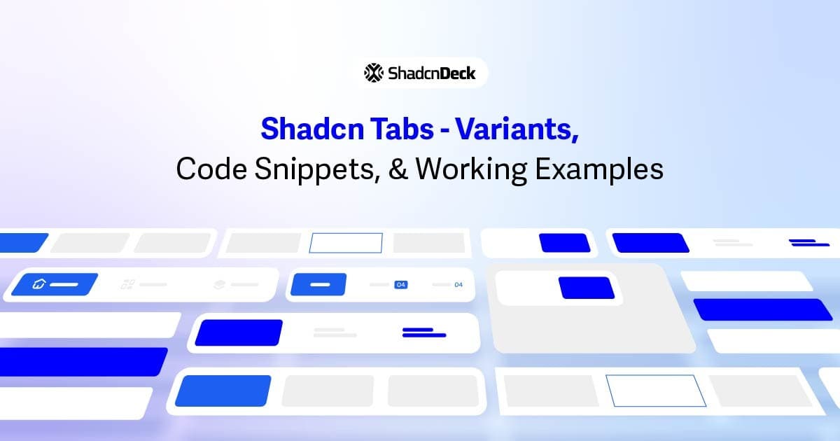
Variations of Shadcn Tabs
Now, I want to get to the most important part of this guide.
Can you guess it? Yes - variations.
I'll show practical shadcn tabs patterns: some inspired by open-source shadcn components, and some I've built from scratch. Each pattern is small, focused, and drop-in ready.
1. Default Horizontal Tabs
This is the classic tabs layout - clean, simple, and usually the first choice for most pages.
Summary and quick info about your data.
When your page has a few sections that need equal weight – dashboards, basic settings, profile pages you can use this shadcn tab variation.
2. Vertical Tabs
Sometimes horizontal space just isn't enough, especially when tab labels get longer. Vertical shadcn tabs solve that cleanly.
Profile information, basic details, and photo settings.
You can use this variation for longer tab labels or pages that behave like a sidebar - settings pages, admin panels, dashboards.
3. Shadcn Tabs with Badges / Counters
Useful when you want to highlight unread items, pending tasks, or anything that needs quick attention.
Messages, notifications, and new updates.
Whenever the number beside a tab has meaning - inboxes, task managers, notification centers, moderation panels.
4. Full-Width Shadcn Tabs
When you want each tab to stretch and fill the entire row, full-width tabs create a balanced, app-like look.
Product info, specifications, and descriptions.
For product pages, mobile screens, or any layout where you want tabs to feel evenly distributed.
5. Tabs with Icons
If your UI leans more visual or you want quicker scanning, adding icons to the tab triggers works really well.
Your main dashboard overview.
When the tabs represent actions or features that users visually recognize - dashboards, mobile UIs, sidebar replacements.
6. Controlled Tabs (With State Management)
This pattern gives you control over the active tab through React state. Helpful when the tab needs to update based on user actions, API responses, or URL changes.
User profile information and preferences.
When tab changes need to trigger logic - form resets, fetching data, updating URL params, syncing with other UI components.
7. Tabs with Disabled States
Sometimes a tab shouldn't be clickable yet - maybe the feature isn't ready, data is still loading, or access is restricted. You can disable individual triggers easily.
High-level information and quick insights.
When a tab represents a feature or section that isn't available yet - onboarding flows, analytics pages, role-based access, or locked sections.
8. Animated Tabs
If you want the tabs to feel a bit more dynamic, you can add a smooth motion effect to the active indicator. This uses a simple Tailwind transition - no external animation library needed.
Account details and personal information.
When your UI feels too static and you want subtle motion to make tab switching feel smoother.
9. Nested Tabs
Nested tabs make sense when you have grouped content inside another group. Think "Account → Billing → Invoices". Just be careful not to overuse them.
Basic account information and preferences.
When a section naturally has sub-sections - billing inside settings, modules inside a course, categories inside dashboards.
10. Card-Style Tabs
This variation blends tabs with a card container, which works well for forms, onboarding steps, and settings pages where you want the content to feel grouped.
Metrics, graphs, and quick insights.
When your content belongs inside a card or panel - forms, advanced settings, configuration pages.
11. Tabs with Custom Triggers
Tabs don't always have to look like tabs. You can turn the triggers into buttons, cards, icons, or any styled element - as long as the value matches, Radix handles the rest.
Active tasks and ongoing work.
When you want tabs to feel more like actionable controls - dashboards, task managers, tickets, workflows.
12. Mobile-Responsive Tabs
On smaller screens, horizontal tabs can get squeezed. A responsive pattern helps the tabs stay usable without breaking the layout.
Your personalized feed and updates.
Any UI that needs to work well on mobile - social feeds, product pages, dashboards, or profile tabs.
Conclusion
Tabs look simple on the surface, but once you start building real layouts, you realize how many patterns you actually need. That's where shadcn tabs help. The component is flexible enough to cover the basics, yet open enough to handle more advanced UI ideas like card layouts, icons, counters, nested sections, and fully controlled behaviors.
Every variation in this guide builds on the same foundation, so you can mix and match depending on your layout. If you're using React or Next.js with Tailwind, these patterns plug in smoothly without extra configuration. And since it all sits on top of Radix UI, accessibility is handled in the background - no custom ARIA work needed.
Use these examples as a toolbox. Pick what fits your UI, adjust the styling, and continue building. That's the whole point of shadcn components: predictable structure, complete control over the UI.

